In Taichung the new elevated train lines with the new train stations were just completed.
The Taichung station is the particular subject of complaints. The new station has only one escalator in each section going up and down -- in the morning these are packed, slowing everyone down. In the old Taichung station the tracks were at street level, and it was possible to run to make a train. Now you have to climb stairs. People are reporting they have to leave much earlier in the morning, and navigation in the new station is difficult.
The new stations are also demonstrating the usual stupidity that marks Taiwan design. They are hideous concrete blocks for starters. Each one is identical, meaning that you actually have to look to see which station you are at, you can't just glance out the window (wooden fence by track? It must be Fengyuan. Curved railings? That's Taiyuan). The government didn't even bother to have them painted differently or create any other markers of uniqueness, such as public art or vendors. It appears to regard vendors with social class-jaundiced eyes. Further, the stations are gigantic, designed on an inhuman scale, far larger than is needed, so obviously Japanese-style construction-state giveaways, metaphors for the public debt in every way... and all that open space, giant roofs -- and no solar panels.
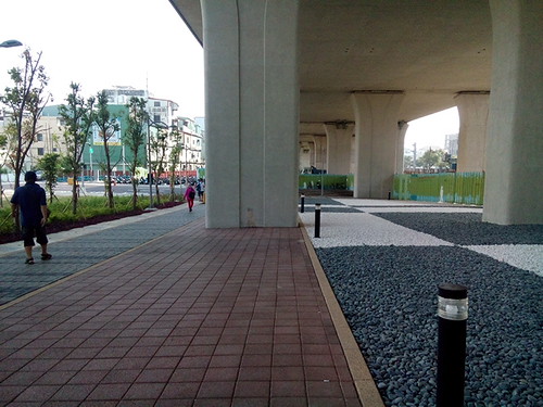
I photo'd the outside of the Tanzih station above. I've used this station for 14 years. The old station was quick, efficient, and human-sized. The new station is a four story hike up stairs. It's ginormous. The ostensible reason for the "improvement" was to elevate the tracks to create space and reduce accidents. Design fail. As you can see, the parking area for scooters is across a four lane street. This street leads to Chunghwa Telecom and the Post Office on the other side, meaning that it will be busy when the road is finished.
Note on the right side of the picture the vast area under the tracks, out of the rain and sun. Ideal for scooter parking, or vendors, or bicycle parking (because of the industrial district nearby the station is flooded with bikes from the workers, naturally despite this being a known need, there is no special provision for them), or some other human need. Instead, it has black and white rocks of stupefying uselessness -- for the sake of black and white rocks uselessly occupying useful space, human beings will have to cross the street and get hit by cars. "Stupid" doesn't even begin to describe how stupid that is.
Ominous rumblings. The new tracks have been the subject of noise complaints even though they have soundproofing. The public is also blaming Taichung mayor Lin Jia-lung for the difficulties people are having getting around in the new station....
_______________________
[Taiwan] Don't miss the comments below! And check out my blog and its sidebars for events, links to previous posts and picture posts, and scores of links to other Taiwan blogs and forums!

3 comments:
Typical modernist planning you see all over Taiwan with a design intended to keep people moving along and not waiting, sitting, using or otherwise cluttering the space.
So do they still have the vendors trackside that sell 油飯?My biggest fear was that they were going get rid of those, and that was my favorite part of the old station.
I was interested in this construction when I was in Taichung last year. While it looks great and allows two previously separated parts of Taichung to better access each other, it seems that passenger flow is not a strong point in their infrastructure design.
Post a Comment